SYNCHRONY WEB SERVICES
Designing and improving account and payment experiences across Synchrony’s digital products.
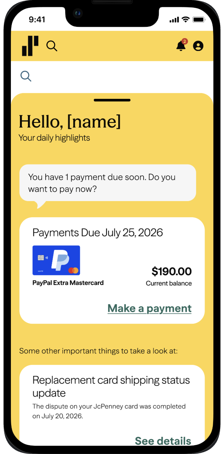
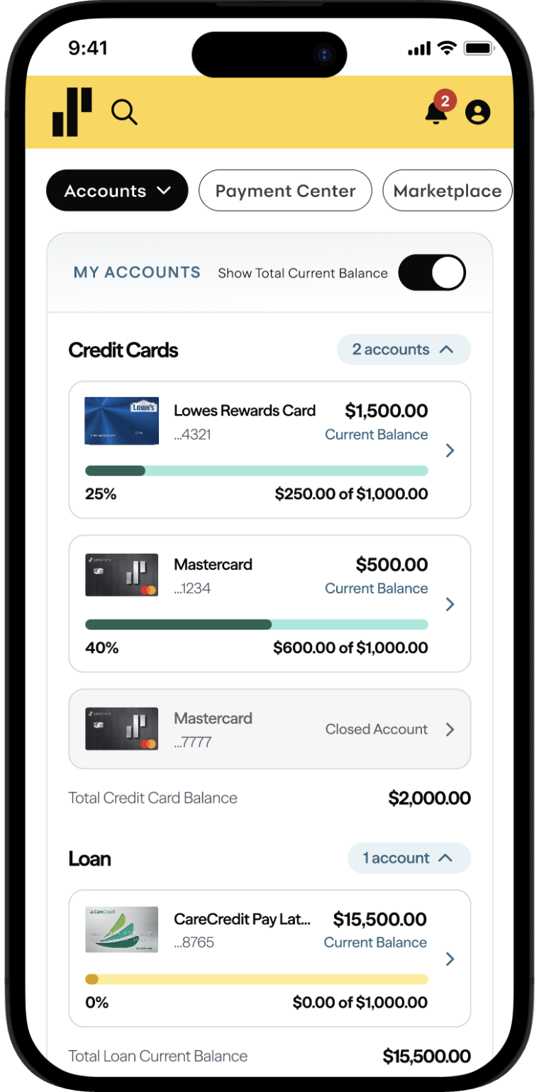
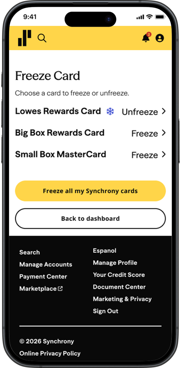
UI/UX Design, Product Research, Prototyping, Design Systems, AI Prototyping
Figma, Figma AI Agent, UserZoom
Synchrony Web Services design team
During my internship at Synchrony, I worked with the Web Services design team on several product experiences related to account management, payments, and financial information.
My work included exploring new interaction patterns, researching existing experiences, creating concepts in Figma, and using feedback from designers and stakeholders to improve my designs.
UI/UX Design · Product Research · Prototyping · Design Systems · AI Prototyping
I worked on early concepts, interaction flows, competitive research, and high-fidelity designs while following Synchrony’s existing design system.
I also experimented with AI-assisted prototyping to quickly explore interaction ideas before refining them in Figma.
Because this work was done inside Synchrony, the research, design explorations, and final screens are password protected. Please reach out and I am happy to share access.
Financial experiences often contain a large amount of information and many possible user actions.
The challenge was finding ways to make important information easier to understand while keeping workflows simple, familiar, and consistent with the rest of Synchrony’s ecosystem.
Across these projects, I reviewed existing Synchrony experiences, researched competing products, and compared different interaction patterns.
I translated those findings into design recommendations and discussed my ideas with designers and stakeholders before refining the strongest directions.
For the account brief, I ran an unmoderated study in UserZoom to understand what people expect from a summary view before committing to a layout. Participants ranked the information they wanted to see first, completed find-it tasks against two different arrangements of the same content, and answered short follow-ups about what they would check on a normal visit versus a stressful one.
Those preferences shaped the concepts directly: the brief opens with balance and due date, keeps the primary payment action next to that information, and limits activity to the few most recent items with a link to the full timeline. I shared the findings alongside the concepts so the recommendations were grounded in what participants said, not only in what looked cleaner.
I explored ideas for improving the Account Manager experience and how users could quickly understand the most important information about their account.
I participated in ideation exercises such as Crazy 8s and created concepts for different layouts and interactions.
One direction explored a more concise account overview that surfaced key information before users moved deeper into the experience.
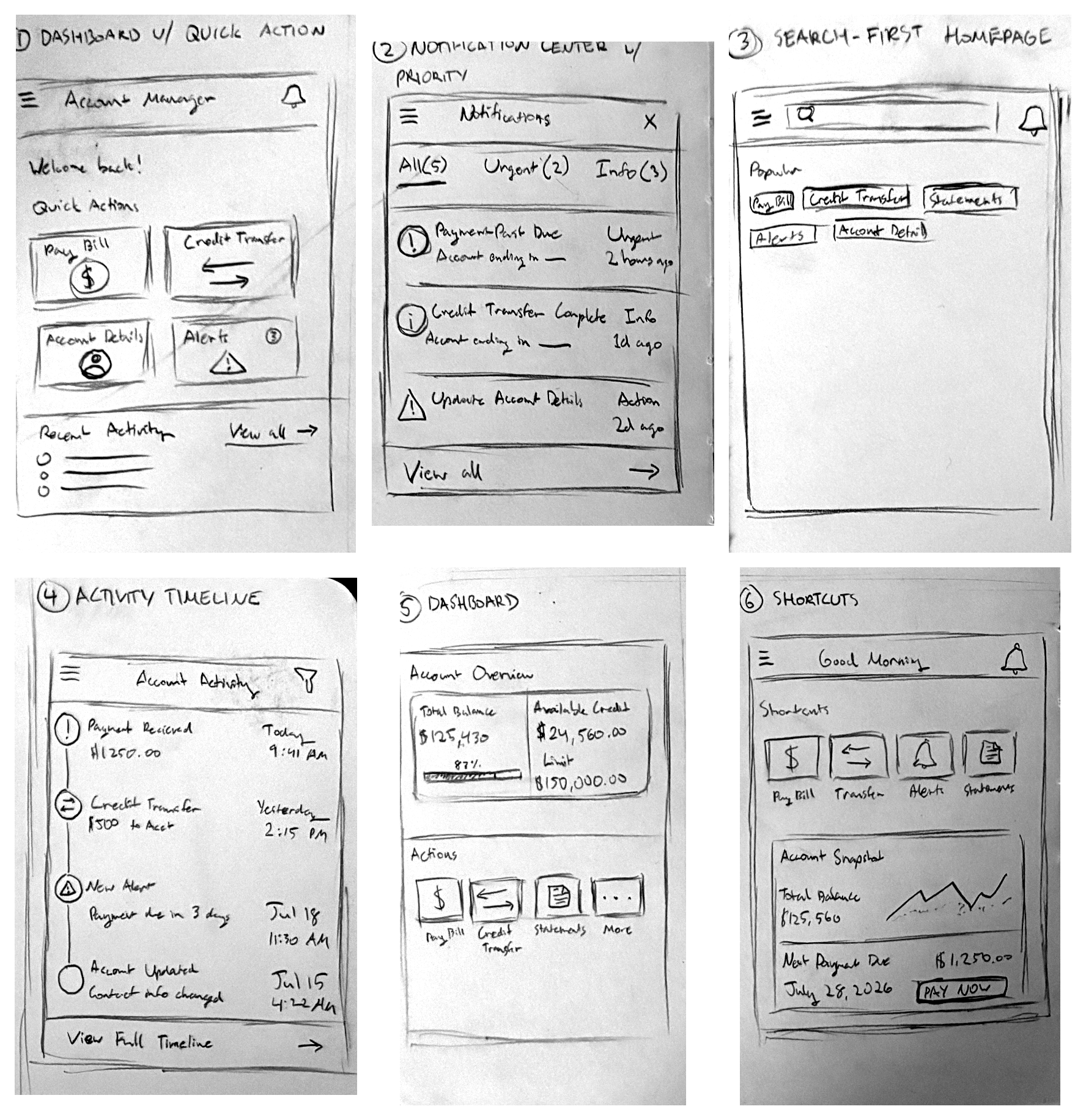
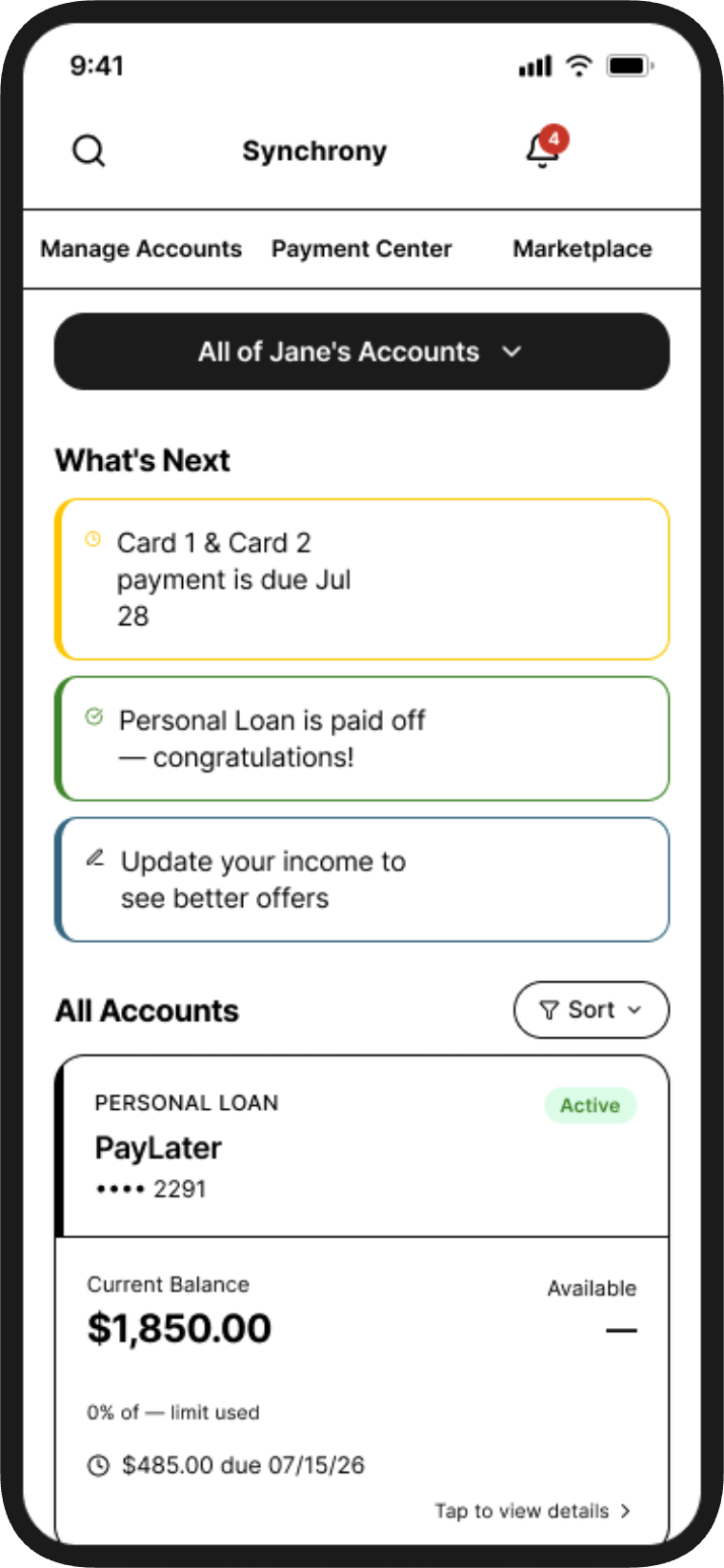
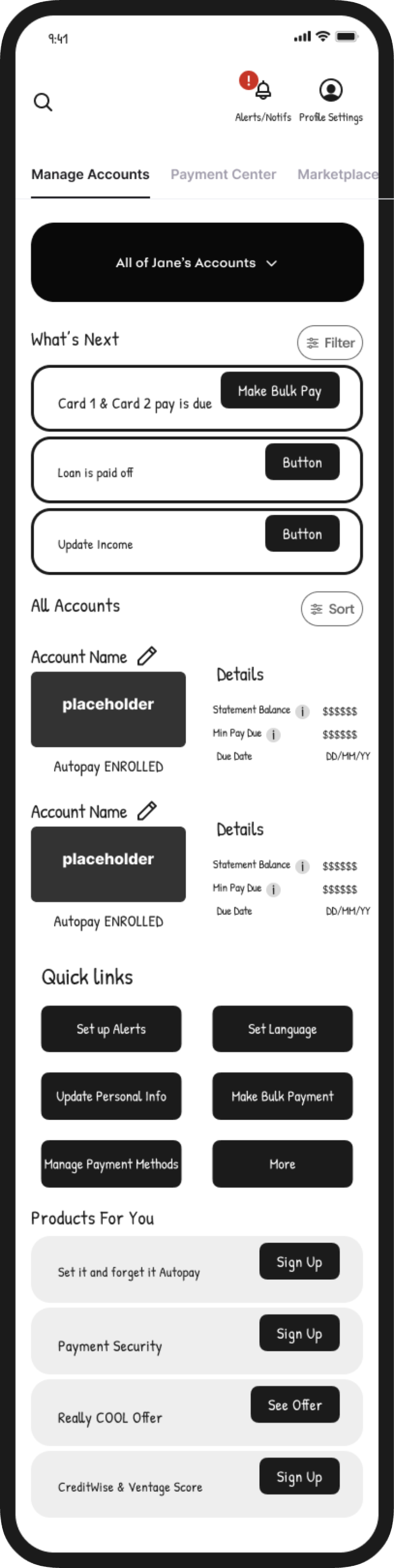
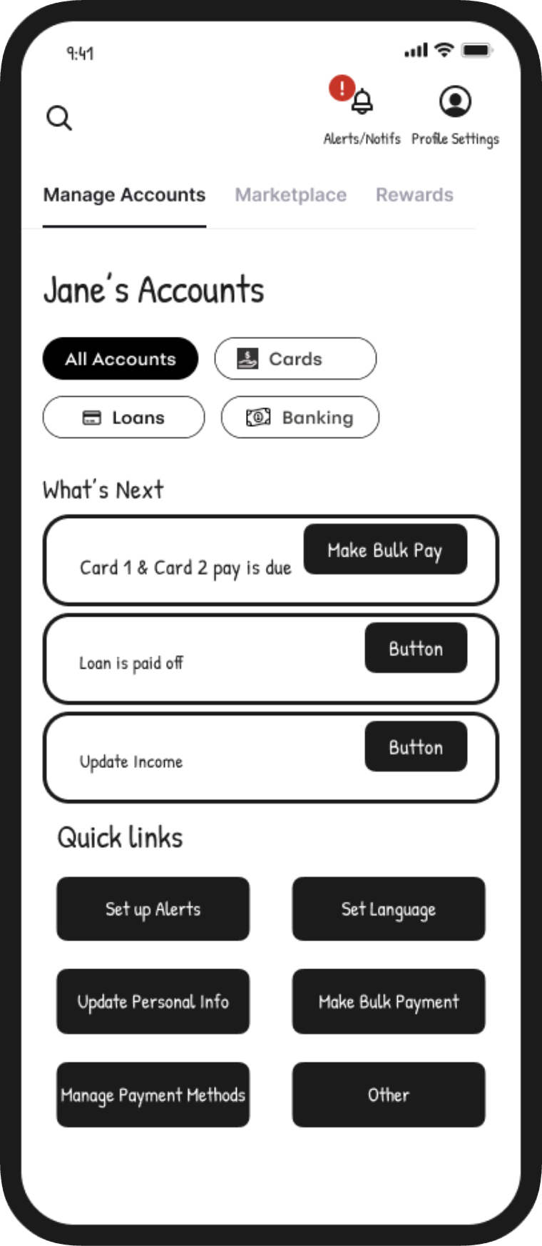
I explored an interaction where users could quickly access a summarized view of their account information.
I used Figma’s AI Agent to test an account brief concept with a swipe-down interaction before refining the idea further in Figma.
This helped me explore how motion and interaction could make account information feel more accessible without adding another complicated navigation layer.
My process usually began with understanding the existing experience and identifying where users might encounter friction or information overload.
I then explored multiple concepts through sketches, Crazy 8s, research, and rapid prototypes.
After reviewing the concepts with the design team, I refined the strongest ideas in Figma using components, auto layout, and Synchrony design-system patterns.
Working with the Web Services team helped me understand how designers approach larger financial products where many experiences have to work together.
I learned how research, interaction design, design systems, and stakeholder feedback all contribute to product decisions.
I also gained experience using AI prototyping as part of the design process, allowing me to explore interactions quickly before investing time in more polished designs.